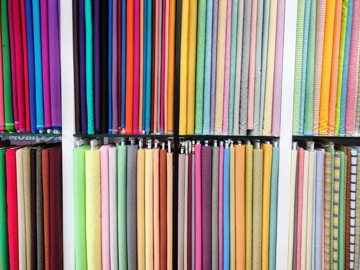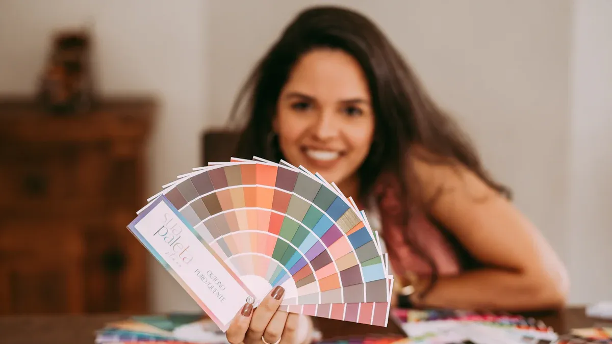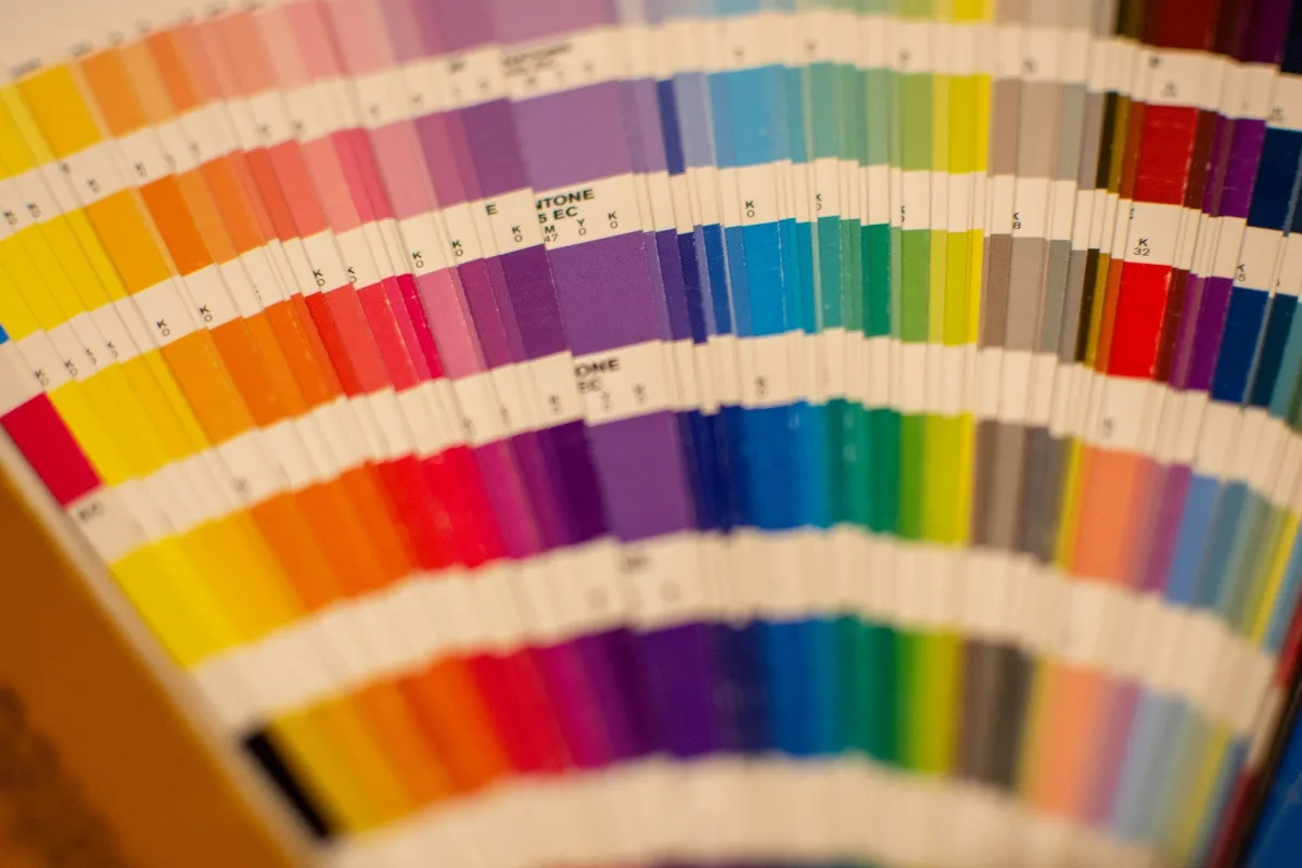
Standard color palettes limit creative expression. They also hinder brand differentiation. Our advanced color library offers an expanded spectrum. It provides greater saturation control and nuanced tonal variations. This allows unparalleled design flexibility. It creates significant visual impact for projects.
Key Takeaways
- Our advanced color library gives designers many more color choices. It helps them make unique and impactful designs.
- This color library helps brands stand out. It makes sure designs are easy for everyone to see, including people with color blindness.
- The library works well with tools designers already use. It helps them create better designs and be more creative.
The Limitations of Standard Color Palettes and the Need for a Superior Color Library

Why Standard Options Restrict Creativity
Designers often encounter significant limitations with standard color palettes. These predefined sets restrict creative expression. They force designers into predictable choices, which can stifle innovation. This lack of diverse options prevents the creation of truly unique and impactful visual experiences.
Impact on Brand Identity and Recognition
Generic color choices significantly hinder brand differentiation in competitive markets. Many service providers appear indistinguishable due to prevalent color schemes, such as common blue logos. This forces consumers to rely on factors like name recognition or price, rather than unique brand identity. Studies show consistent use of signature colors boosts brand recognition by up to 80%. Furthermore, 81% of participants remembered a brandâs color, while only 43% remembered its name. This highlights color’s crucial role in consumer recall. A study by the CCI: Institute for Color Research found that 92.6% of surveyed individuals consider color the most crucial factor in purchasing decisions. A distinctive color library becomes essential for standing out.
The Inadequacy of Basic Color Models
Basic color models like RGB and CMYK possess inherent limitations. RGB can produce colors impossible to achieve with CMYK inks, causing color shifts during conversion. CMYK also has a smaller color gamut, meaning it cannot replicate some vibrant RGB colors in print. Moreover, these models do not fully represent human color perception. They are not directly based on the types of cones in the human eye. Different light signals can have identical RGB components, failing to capture the full spectrum of perceivable colors. This inadequacy necessitates a more advanced system for precise and nuanced color representation.
Our Advanced Color Library: Features and Benefits Beyond Market Standards

<<<START_SECTION_CONTENT>>>
Our Advanced Color Library: Features and Benefits Beyond Market Standards
Expanded Hue Range and Saturation Control
Our advanced color library moves beyond basic color models. It offers an expanded hue range and precise saturation control. This allows designers to access a spectrum of colors previously unavailable. The library incorporates various sophisticated RGB color spaces. These include sRGB, Display P3, A98 RGB, Rec. 2020, ProPhoto RGB, Rec. 709, Rec. 2100 PQ, and Rec. 2100 HLG. It also includes their linear counterparts.
The library also utilizes cylindrical sRGB spaces. Examples are HSV, HSL, HWB, HSI, Okhsv, Okhsl, HSLuv, HPLuv, and Cubehelix. For even greater precision, it supports XYZ spaces like XYZ D65 and XYZ D50. Furthermore, the system integrates advanced Lab-like spaces. These include Lab D50, Lab D65, Oklab, Oklrab, Luv, DIN99o, Jzazbz, Hunter Lab, RLAB, IPT, ICtCp, IgPgTg, CAM02 UCS, CAM02 SCD, CAM02 LCD, and CAM16 UCS.
Beyond digital representations, our color library leverages cutting-edge LED technology. RGBA LEDs incorporate red, green, blue, and amber. Amber expands the color range to include warm tones like rich gold, yellow, and orange. RGBW LEDs add a separate white LED. This produces better-quality whites and enables saturated reds, pastels, and diverse colored light. IntelliHue uses carefully selected LED channels. It produces an enhanced spectrum of precisely controllable light. This allows for millions of saturated colors, pastels, and high-quality white light from one luminaire.
Nuanced Tonal Variations for Depth
Our color library provides nuanced tonal variations. These variations add significant depth to designs. Designers can use descriptive phrasing like ‘low saturation, pastel tones’ for calm aesthetics. They can also use ‘vivid but balanced contrast’ for dynamic imagery. This guides AI in understanding emotional temperature. Negative prompts, such as ‘no neon tones’ or ‘no color bleeding’, prevent oversaturation. They ensure harmonious color transitions.
Integrating camera-based terminology also enhances realism. Phrases like ‘shot on 50mm lens’ or ‘soft key light from window’ provide a lighting blueprint. This improves depth and smoother transitions between hues. Negative prompts like ‘no oversaturation, no orange glow, no HDR light’ maintain midtone structure. They achieve believable light.
The Tonal Grading System, also known as Color Grading, manipulates colors. It evokes specific moods in images. This system uses Gradient Maps. It adjusts their colors, opacity, and blend modes. This creates diverse effects. It integrates with the Digital Zone System and the Color Zone System. This allows independent control over highlights, midtones, and shadows. This differs from standard HSL adjustments.
Designers can increase saturation for final palette values. This is especially true for green colors. Tints lose tonal brightness due to transparency adjustments. Shifting the hue towards a more red value for yellow and orange shades prevents them from appearing muddy on dark backgrounds.
Subtle tonal shifts are crucial for perceiving three-dimensionality in two-dimensional designs.
| Tonal Element | Role in Three-Dimensionality |
|---|---|
| Highlights | Brightest areas where light directly hits, used to emphasize focal points and define illuminated surfaces. |
| Midtones | Middle values that blend light and dark areas, crucial for smooth transitions and creating harmony between light and shadow, contributing to natural flow and realism. |
| Shadows | Darkest areas that establish contrast, ground the subject in its environment, and define the unlit or less lit portions of a form, enhancing depth. |
In tonal drawing, outlines are replaced by shadings. Tonal values specify shapes, texture, and depth of forms. This method uses light and dark to create realistic effects. Artists emulate how light interacts with objects. This builds depth and volume on a two-dimensional plane. Tonal variation is inestimable in art. It forms the ‘body’ of a visual composition. It frames form and space. Without it, an artwork can appear flat or uninspired. Tone allows artists to highlight light and shadow. This significantly enhances overall depth and dimension.
Grisaille forces artists to focus entirely on value. This is the lightness or darkness of a tone. It masters form, light, and shadow. It defines every curve, plane, and texture. It imbues objects with weight and solidity purely through tonal values. The technique demonstrates how light interacts with objects. It forms the bedrock of perceiving three-dimensionality on a flat surface. Removing color creates a direct channel to our perception of reality. The brain processes spatial information and depth cues more clearly. Mastering subtle tonal shifts in grisaille makes objects appear perfectly round, solid, weighty, and tactile. It provides the fundamental structure that color later enhances.
Accessibility and Inclusivity in Our Color Library
Our advanced color library prioritizes accessibility and inclusivity. It supports colorblind users and individuals with visual impairments. Designers should not rely solely on color to convey meaning. They should use words or patterns in conjunction with color. Tools like WAVE and WebAIM’s contrast checker help test color and contrast combinations. The Colorblind Web Page Filter visualizes how a page appears to individuals with various types of color blindness.
Designers should avoid combining red and green. Instead, they can use blue and red, or orange and yellow, as basic hues. They can vary saturation or lightness for different shades. Using shapes and icons adds to or replaces color-coding. Employing direct labels instead of legends conveys information clearly. For line charts, designers can use dashed lines or lines with various stroke thicknesses. Adding strokes around chart elements helps distinguish them. If color is necessary, a single hue palette or a red-yellow-blue palette works well. Using color for groups rather than individual categories reduces visual clutter and confusion.
The website ‘whocanuse.com’ highlights how color contrast impacts individuals with various visual impairments. It provides a contrast ratio and WCAG grading for color combinations. It details how conditions like Protanomaly, Deuteranopia, Tritanopia, Achromatopsia, Cataracts, Glaucoma, and Low Vision are affected. The tool uses plugins like Chroma.js for contrast calculation and Color-blind for color blindness simulations. It also uses custom simulations for other conditions. This helps users understand the visual strain a color combination might cause.
Seamless Integration with Existing Workflows
Integrating our advanced color library minimizes disruption to current design workflows. The process begins with assessing and planning. Teams thoroughly evaluate current workflows and plan the integration strategy. Stakeholder engagement is crucial. All relevant parties are involved to ensure alignment and understanding. Phased implementation introduces the new system in stages. This minimizes immediate impact. Comprehensive training and ongoing assistance are provided to users. Data migration and testing are carefully managed. Teams rigorously test the new system before full deployment. A feedback loop establishes mechanisms for continuous feedback. This addresses issues promptly. Continuous monitoring and optimization regularly review performance. This makes necessary adjustments.
Integrating new systems without disrupting existing workflows involves meticulous planning, clear communication, and phased implementation. This includes understanding current workflows, involving stakeholders, providing comprehensive employee training, having a fallback plan for unexpected issues, thorough data migration, extensive testing, ongoing support mechanisms, monitoring and ongoing evaluation, preparing documentation, and ensuring compliance, security, and continuous evaluation.
To minimize disruption, aligning to the ‘why’ of the new system is crucial. This helps stakeholders understand that some workflow disruption is a routine consequence of new software. It is often easier to change a process than to customize software. Preparation is key. Teams map out current workflows, document handoffs and controls, and codify necessary workflow changes. Affected participants are engaged throughout this process. Before full deployment, teams test new workflows in a sandbox or with a small number of transactions. This confirms consistent outcomes.
Thorough testing and validation are essential before deploying new systems to a production environment. This checks that systems function as expected. Data transfers correctly. Workflows remain undisrupted. No errors or conflicts arise. Various testing methods, such as unit, integration, system, or user acceptance testing, are employed. Tools like mock servers, simulators, or emulators mimic system behavior. This rigorous testing identifies and resolves issues before they impact operations.
Training and supporting users are vital once new systems are ready for launch. This ensures smooth adoption and minimizes disruption. It includes explaining the purpose and benefits of the new systems. It explains how they affect existing workflows and how to use them effectively. Training is delivered through online courses, webinars, manuals, or videos. Ongoing support, such as help desks, forums, or feedback channels, helps users overcome resistance or confusion. They embrace the new systems.
After launching new systems, continuous monitoring and evaluation are necessary. This ensures they meet needs and goals. It involves collecting and analyzing data on performance, usage, and impact. KPIs, metrics, or reports are used. Tools like dashboards, alerts, or logs track and visualize this data. Soliciting feedback from users, customers, or stakeholders measures satisfaction and expectations. This ongoing process identifies and addresses problems or opportunities for improvement.
Elevating Brand Aesthetics and User Experience with Our Color Library
Our advanced color library significantly elevates brand aesthetics and user experience. It offers measurable improvements in user engagement. Websites see a 25% increase in engagement. Brand recognition increases by 30%. Personalized color palettes, based on user behavior and regional preferences, boost brand engagement and recognition by up to 25%.
An expanded color palette contributes to a more sophisticated brand aesthetic. The Golden Hour Palette, with light champagne, rich gold, sage taupe, and deep charcoal, creates a coastal-luxe aesthetic. It conveys luxury, sophistication, and organic authenticity. The Coastal Serenity Palette uses soft blues, sandy beiges, and neutral tones. It evokes tranquility, sophistication, and natural elegance. Neutral tones add warmth and accessibility. Navy provides depth and trustworthiness. The Earthy Sophistication Palette blends sage green and neutral taupes. It promotes stability, growth, and organic luxury. It balances organic elements with refined sophistication. The Earthen Elegance Palette combines organic neutrals and deep forest tones. It embodies natural luxury and high-end design. It uses soft taupe, warm sand, deep olive green, and rich dark brown. This conveys stability, timelessness, sophistication, and natural depth.
The strategic design of expanded color palettes allows for richer, more nuanced expression of brand values. These include trust, luxury, authenticity, and tranquility. Curating combinations like those in the ‘Golden Hour’ or ‘Earthen Elegance’ palettes positions brands for success. It builds strong recognition. It attracts target audiences by communicating clear, consistent messages. These messages blend natural authenticity with premium positioning and modern luxury. This contributes to a more sophisticated aesthetic.
Unleashing Creative Potential and Gaining Competitive Advantage
Our advanced color library unleashes creative potential. It provides a significant competitive advantage. SuperAGI’s experience demonstrates a 25% increase in design concepts per project. They directly attribute this boost in creative output to time saved by using advanced color tools. This allowed designers more time for creative work. It led to higher-quality outputs.
Jessica Walsh, a notable designer and artist, utilized AI-generated color palettes. She produced a series of bold and innovative designs. This approach enabled her to explore new and unexpected color combinations. It resulted in a unique and distinctive visual style. This gained significant recognition in the design community.
Designers using AI-powered tools are 72% more likely to experiment with new colors and techniques. Designs created with AI-generated color palettes were 25% more likely to be shared on social media. They were also 30% more likely to be liked than those using traditional methods. This demonstrates the power of an advanced color library in fostering innovation and engagement.
<<<END_SECTION_CONTENT>>>
Accessing and Implementing Our Advanced Color Library
Simple Steps to Get Started
New users can easily begin using the advanced color library. First, open Adobe InDesign. Then, navigate to Window > CC Libraries to access the panel. Within the Libraries Panel, create and name a new library. Select ‘View by Group’ in the Libraries Panel. Add your desired Pantone Coated color from the Swatches Panel. Add the fill color to the Libraries Panel. The Pantone color is now added to your library. Create a group named ‘Pantone Coated’ in the Libraries Panel. Drag the Pantone colors into this new group. Before implementation, users must purchase, download, and install Color Library profiles. Adobe Photoshop is necessary for image conversion, and Adobe InDesign for exporting to PDF. The system requires Mac (10.5 or higher) or Windows (2000 or higher). Images must be in RGB, CMYK, Lab, or Grayscale mode and 8 Bits/Channel. High-quality input files are recommended. Retouch images before profile conversion.
Tools and Resources for Color Creation
Our advanced color library provides specific tools for custom color palette generation. The Palette Generator creates custom color palettes rapidly. The Image Picker extracts color palettes directly from uploaded photos. Users can also Make a Gradient Palette to generate palettes specifically for gradients. For advanced custom palette generation, the Pro feature allows users to generate palettes with more than five colors automatically or by applying color theory rules. A ‘Palette Visualizer’ tool checks colors on real designs. Educational resources help users master advanced color creation techniques. The Adobe Photoshop Advanced course covers advanced techniques for color correction, retouching, and automating tasks. It introduces new AI features and smart filters. The Adobe Illustrator Advanced course focuses on advanced effects and tools like gradients, blends, and patterns. It also delves into Illustrator’s AI capabilities, including generative color.
Support and Community for Your Color Library Journey
Users receive comprehensive support for their color library journey. Technical support for the advanced color library, specifically ‘Advanced HDR by Technicolor’, is available. Users can contact them via email at info@advancedhdrbytechnicolor.com. This ensures users have assistance when needed.
Our advanced color library moves beyond standard constraints. It offers unparalleled visual richness. Designers achieve creative freedom. They transform their designs with expanded options. This elevates brand aesthetics. Businesses stand out effectively in the competitive market. Embrace these tools. Unlock new creative possibilities.
FAQ
What makes this color library different from standard options?
This library offers an expanded hue range and precise saturation control. It includes advanced color spaces and LED technologies. This provides unparalleled design flexibility.
How does the color library help with accessibility?
It supports colorblind users and those with visual impairments. It provides tools to test contrast and visualize how colors appear to different individuals.
Can this color library integrate with existing design software?
Yes, it integrates seamlessly. The process involves planning, stakeholder engagement, and phased implementation. Comprehensive training and support are also provided.


